New Packaging for Swee Kombucha by Bedow — BP&O

Opinion by Richard Baird
Posted 19 April 2022
Although its recent rise to popularity has been rapid, running a quick search on ‘kombucha’ reveals that until the 21st century it had seen little category growth since its creation, more than 2000 years ago. For the uninitiated, kombucha is a fermented, non-alcoholic sweetened tea containing vitamins, amino acids and nutrients. This mix of familiarity (as a tea), its sweetness and health benefits, combined with consumer appetite for ‘something different’, has seen it move into the mass market, making its way into the portfolios of some of the world’s top FMCG companies.
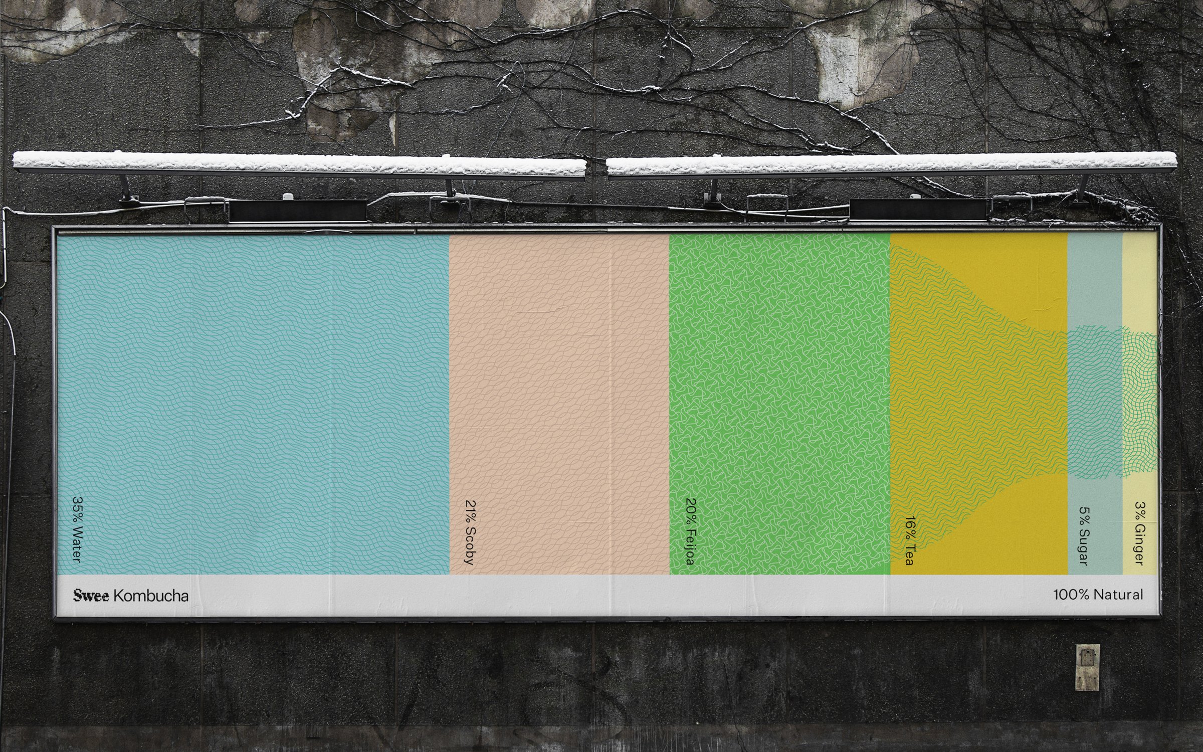
Swee is new addition, launching in Georgia, where the kombucha business is still small and relatively underdeveloped, despite the country’s increasing reputation as a culinary destination. Few Georgian kombuchas contain live cultures (or enough to be considered a kombucha elsewhere), and this provided a unique opportunity for a design debut to announce the flavor experience. Swedish studio Bedow worked with the brand to develop a visual identity and packaging treatment. Recognizing the value in the natural constituent parts and percentages of Swee’s products, Bedow’s solution juxtaposes the rationalized and the organic.
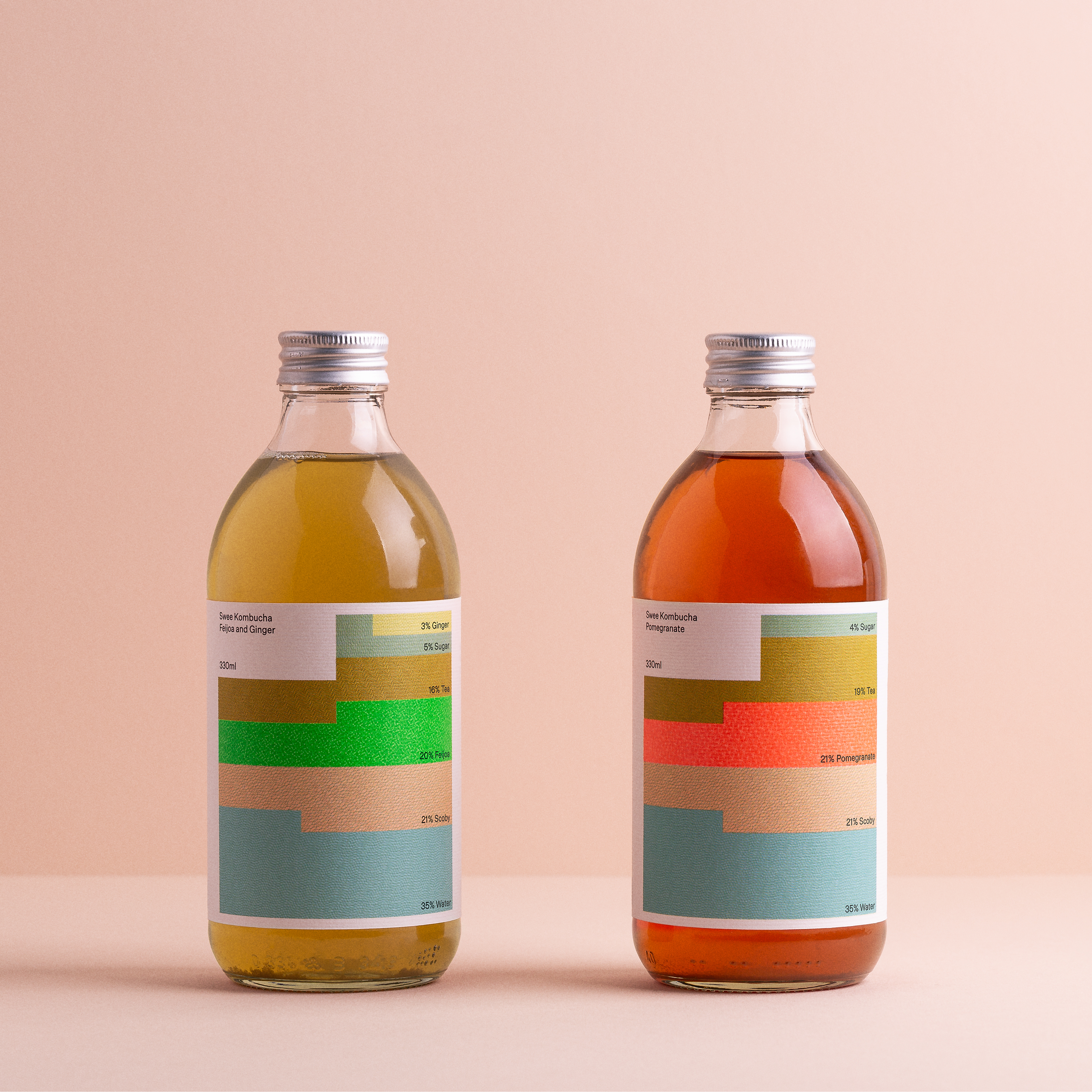
Fundamentally, Bedow employs contrast on various levels to generate interest. First it triggers the involuntary feeling we have of being drawn to something aesthetically pleasing. Then there is the suggestion of meaning: a puzzle to be solved or understood, something to be discovered, triggering the cerebral. This comes from the intersection of bright color blocking and a rationalized grid system, informed by the consistent parts of the drink that would typically be communicated back of pack through type.
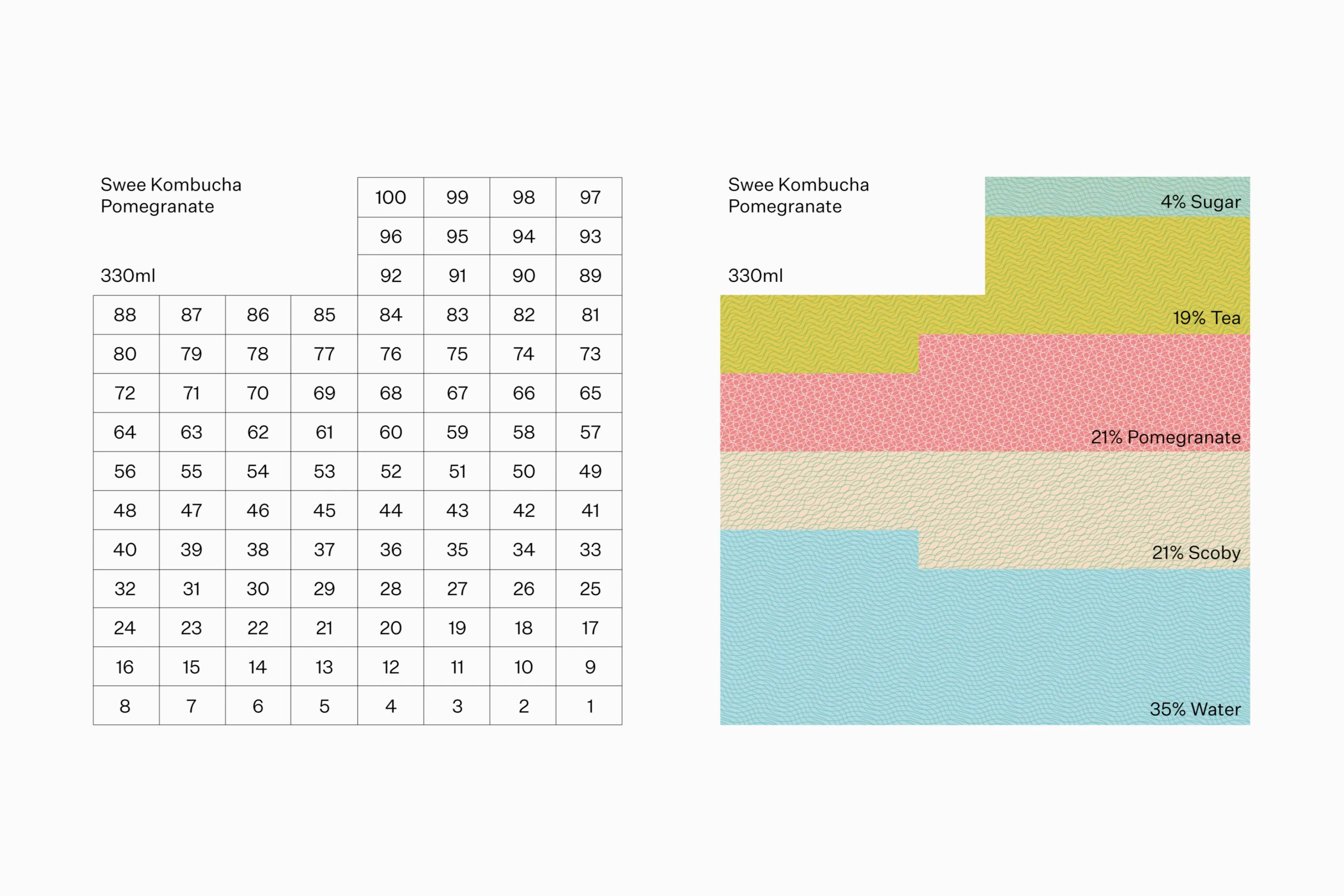
Although there are other examples of this, the structure of the ingredients and the balance of bright neon spot color with softer pastels creates a unique and striking graphic gesture that sets the brand up well for future product variations. It’s particularly appealing to those interested in systems; perhaps even, design and formulation could become concurrent considerations.
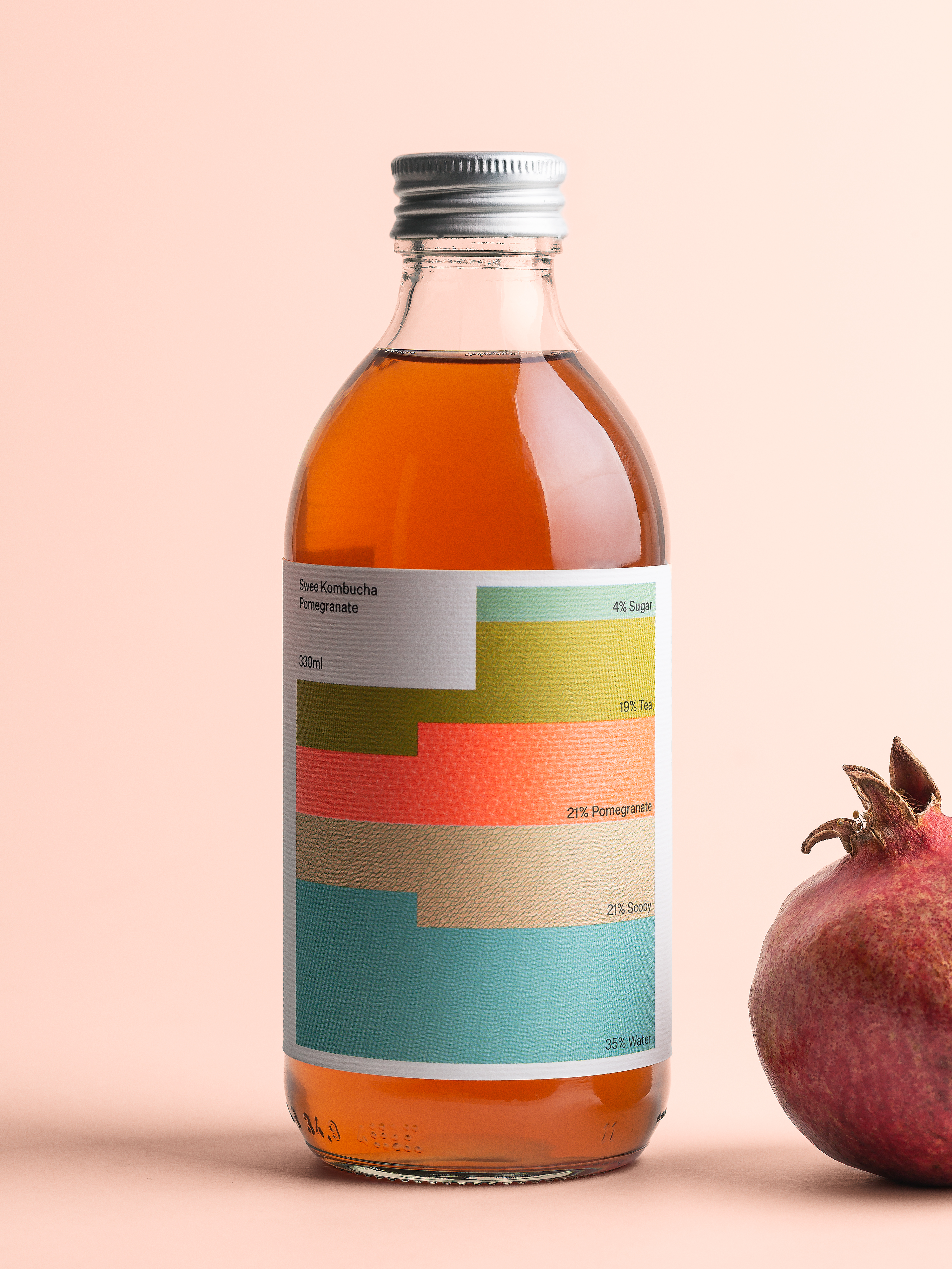
The idea of surprising contrasts continues up-close with the initial impression of solid colour-blocking giving way to a series of ‘live’ patterns, tiny and organic with laid paid conferring a material texture. This really sets up a broader suite of organic forms and motion that is developed for onscreen contexts. The micro becomes the macro as the suggestion of live cultures is emphasized through scale and in the interplay of animated forms. These help to link the rationalized and structured system of packaging with the more organic and vital expression of the brand as it exists online.
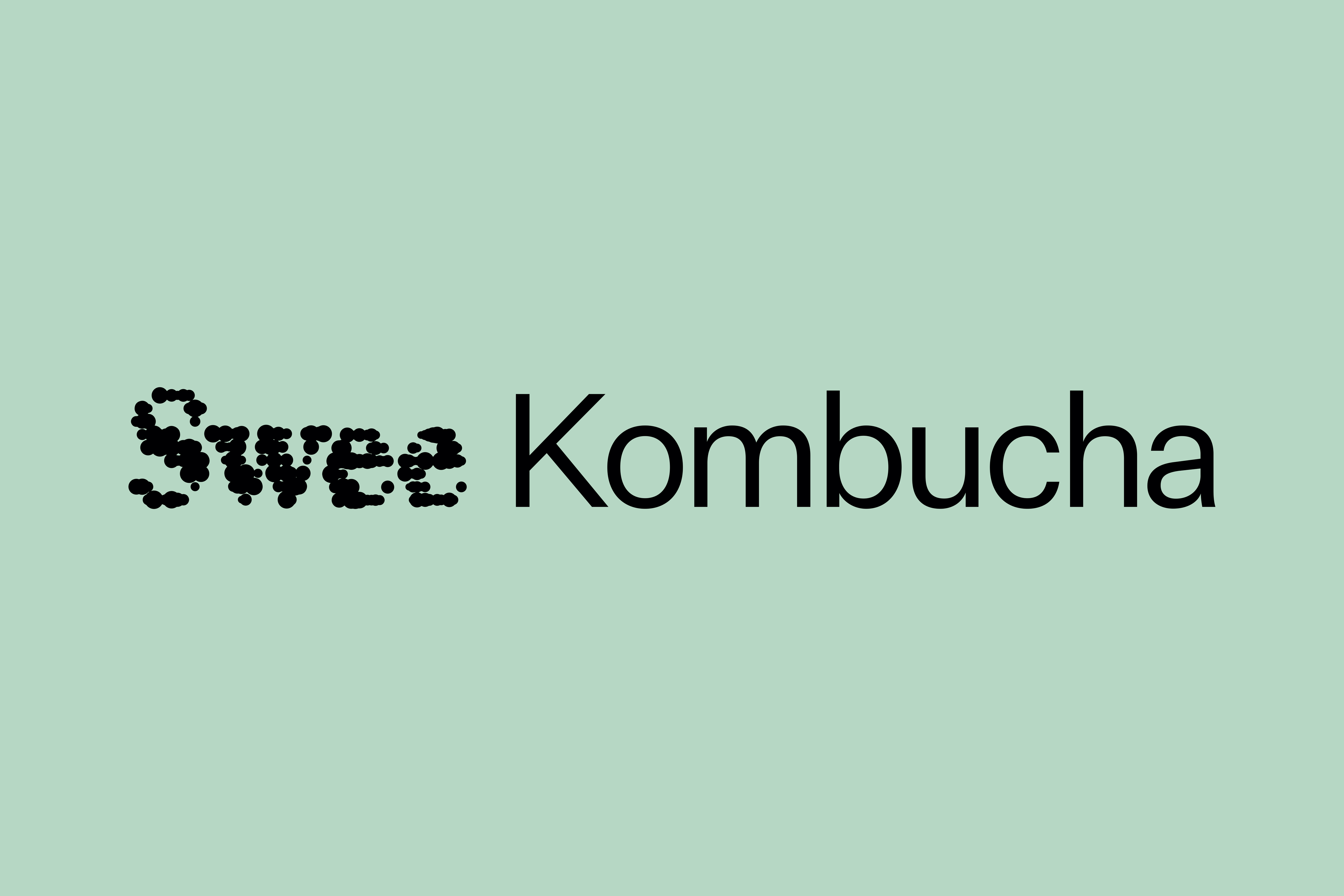
The same concept is present in the logotype as a juxtaposition of static organic forms and rationalized sans serif, though it is the least satisfying articulation of the principle. For the most part, ‘Swee’ is used alone, printed on the caps of bottles and within the context of social media icons. Elsewhere it comes alive in the form of motion graphics that give the impression of something living at a microscopic scale.
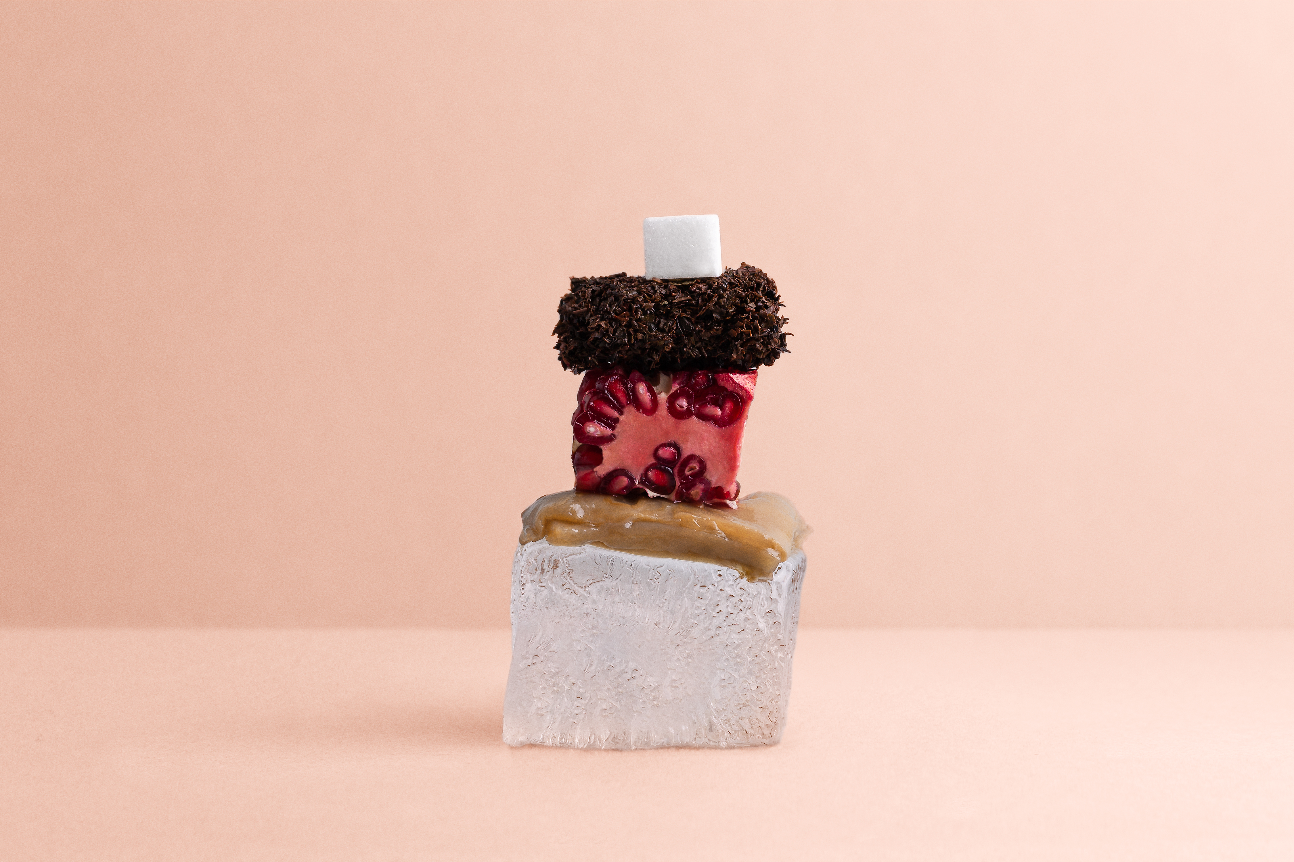
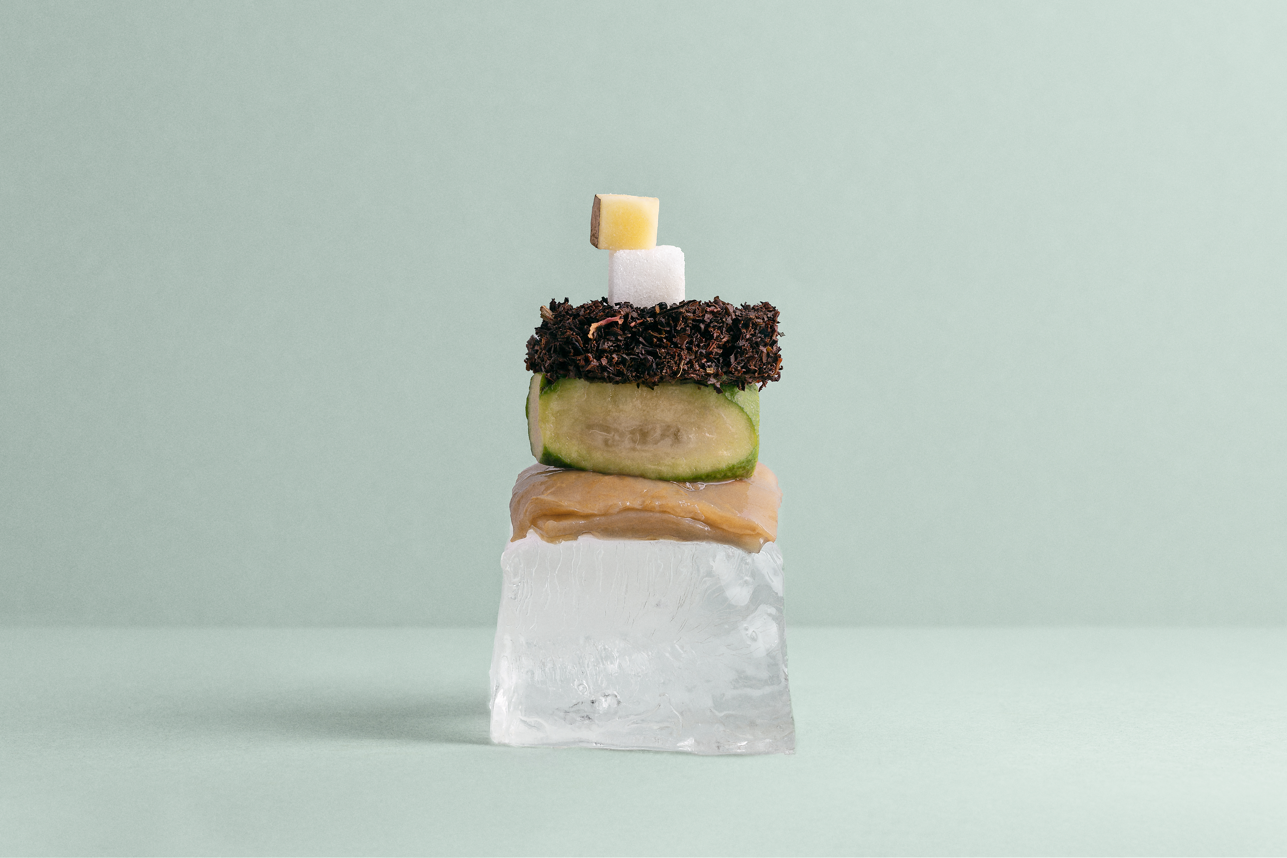
Bedow’s concept, and its application across packaging is engaging both from a distance and up-close. For many that would perhaps be where it would stop, however, an additional manifestation of the concept plays out in still life. These images effectively further the idea through material, and where the intersection of organic and structured was less successful in the logotype, here, that bridge between the two appears far more interesting. The stacking and proportionality are all there, but the literal ingredients provoke other senses and offer a more unique and artful presentation of flavour.
Together, rationalized system and organic matter, and the various manifestation of that core idea, in motion and static in print, delivers a breath and world of kombucha that is immediate and visually arresting but then follows with plenty of tiny details.
