New Branding & Packaging for Omaka by Stockholm Design Lab — BP&O

Opinion by Eleanor Robertson
Posted 31 March 2022
According to Sweden’s travel and tourism website, craft beer enthusiasts will discover a ‘smorgasbord’ of artisanal, eco-friendly and organic things to drink there, with more microbreweries per capita than any other country (apart from the UK). Omaka joined the scene in September 2020, at the height of the pandemic, and with a slogan to match his fearless attitude: ‘taste before style’. Good taste, that is, not just flavour, because the emphasis extends beyond the quality of beer, to the art behind it.
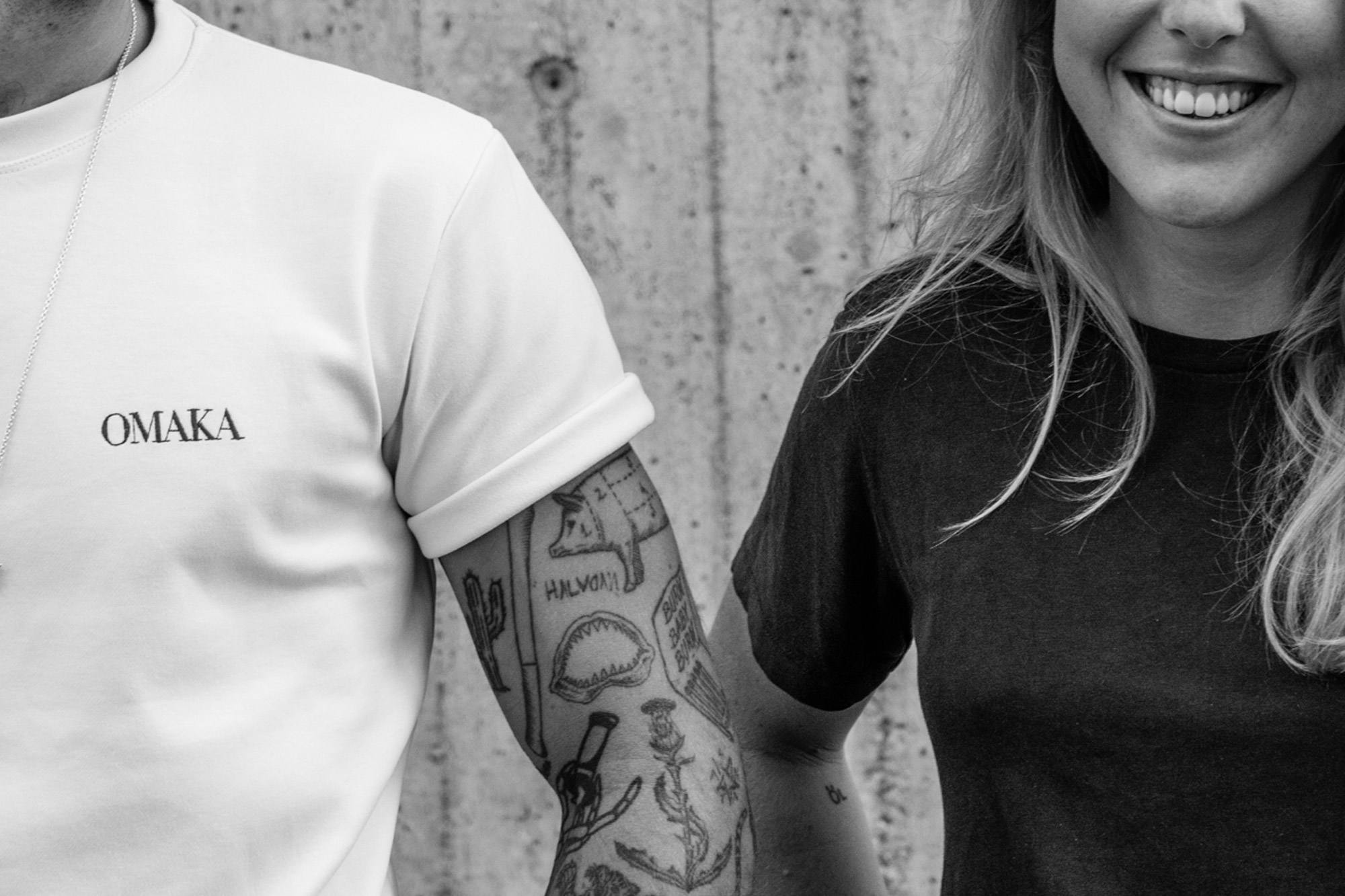
Created by Sweden’s youngest brewmaster Hedda Spendrup, Omaka occupies the former School of Architecture in the center of Stockholm. The distinctive concrete campus divides opinion with its unapologetic brutalist lines, raw materials and asymmetric windows – it’s often listed as the city’s ugliest building, yet it is also recognized as an important site of cultural-historical value, and even beauty.
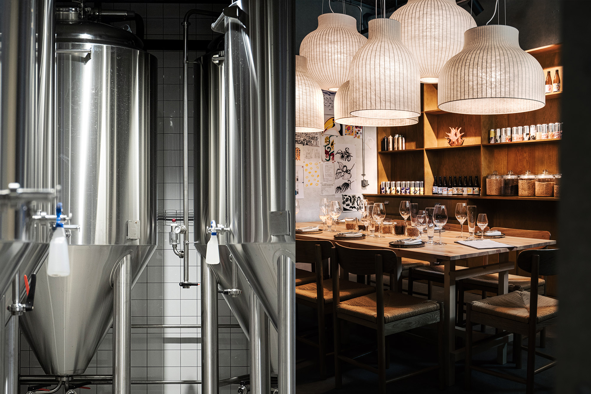
Inside, ‘A-house’ has been transformed into a comfortable living room with industrial details, and a spacious bar overlooking the immaculate brewery. There is also an elegant open kitchen concept where head chef Christian Siberg (finalist in Sweden’s ‘Chef of the Year’) creates modern dishes with influences from around the world, designed to complement – and contrast with – Omaka’s inventive beers. So there are dichotomies to consider: taste and style, ugliness and charm, beer and food.
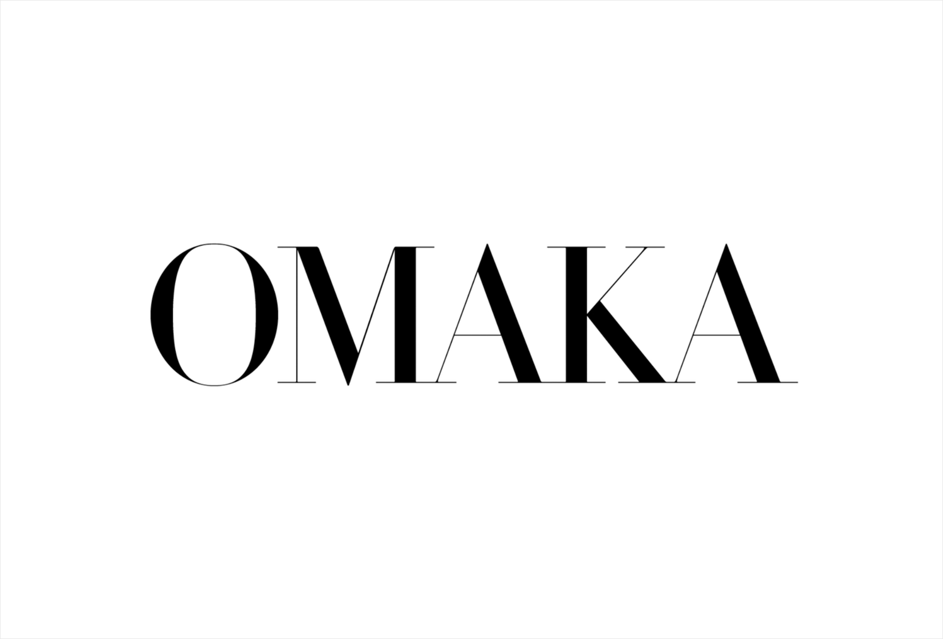
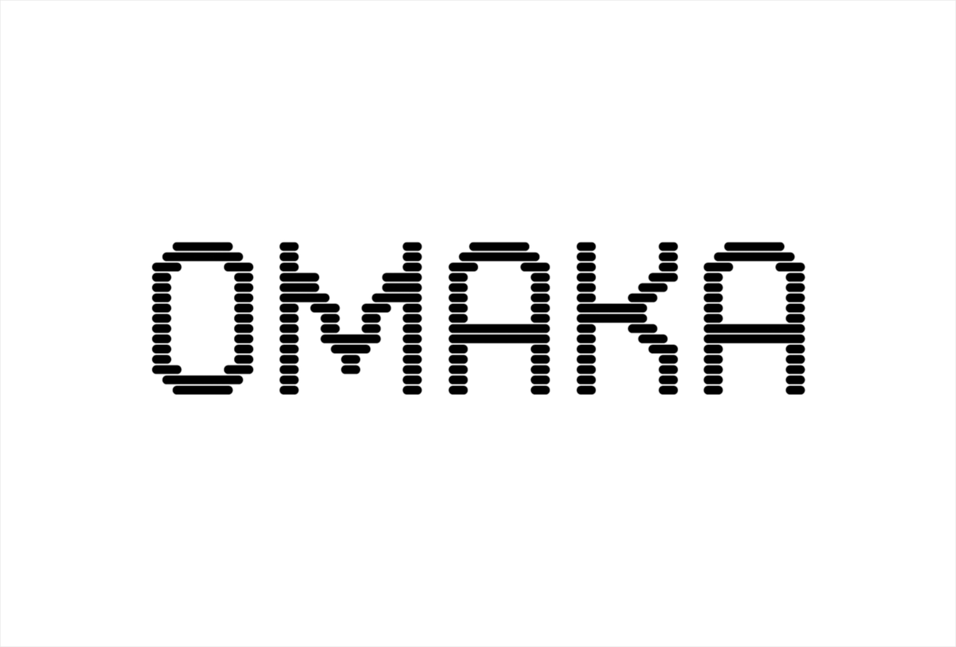
Multidisciplinary design agency Stockholm Design Lab worked as strategic partner on the launch with a brief ranging from naming through to branding, packaging and brand implementation. The identity is a visual expression of the brewery’s name, Omaka, which is one of those untranslatable words, revealing something about the culture tied to the language (think ‘schadenfreude’ or ‘wabi-sabi’).
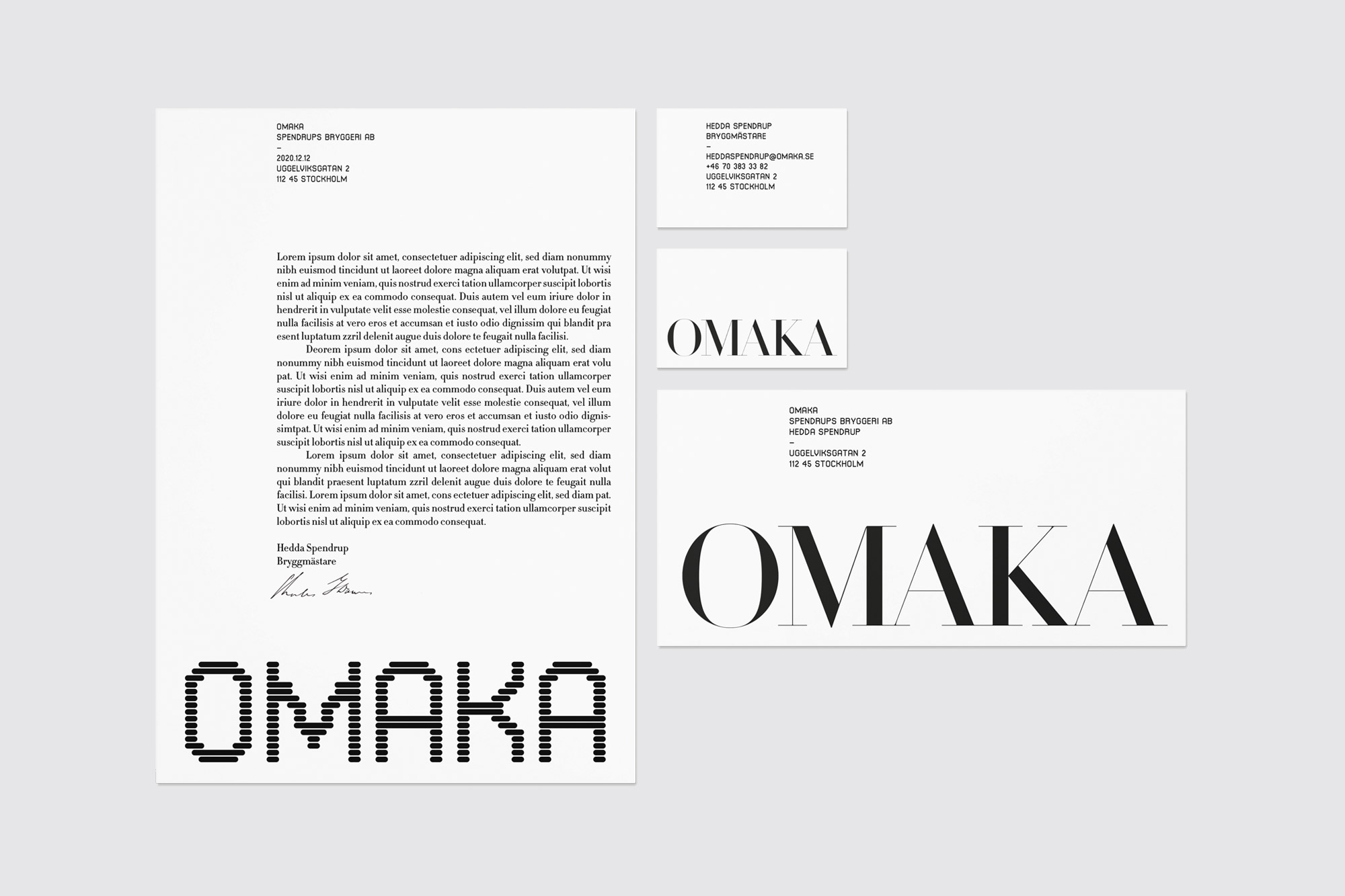
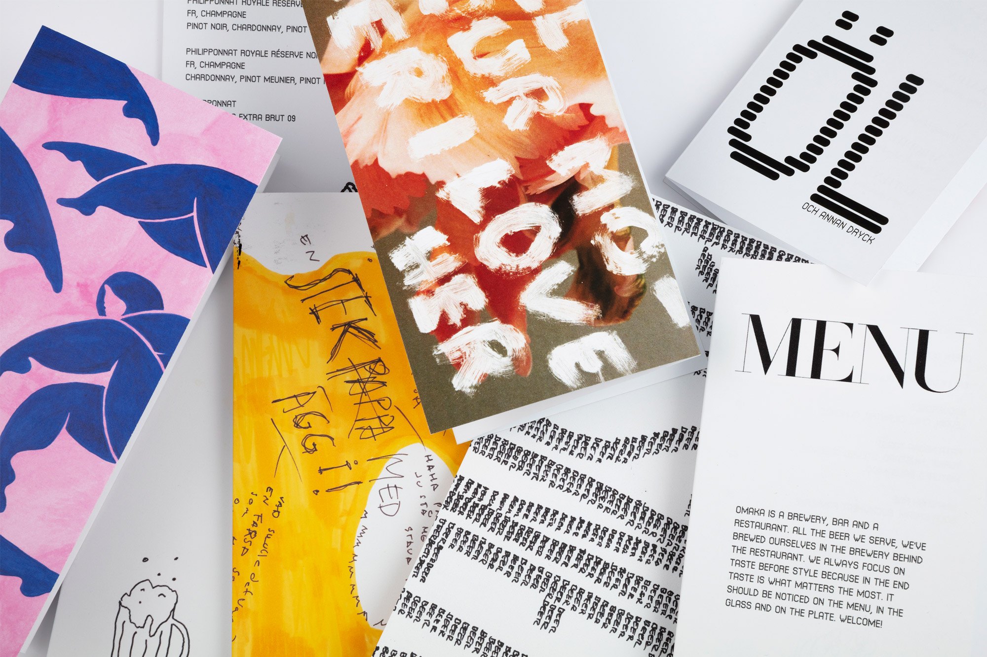
An approximate translation, according to the studio, might be ‘odd, mismatched, incongruous or diverse’. Omaka means ‘one of a kind’, ‘deviating from the norm’, though – linguistically speaking – a counterpart is implied. This idea of ’a pair, but not a pair’ is reflected in the logo, which comes in two versions, each with its own character and origin. The contrasting fonts interact with similarities of structure and proportion, despite a tension between classical sophistication and digital functionality.
The irregularity is pleasing, blending Scandinavian simplicity with a joyful imperfection that bears Japanese influence – the pairing is intuitive and poetic, clean but not sterile, simple yet smart. We’re told that this represents the contrasts that the brand wants to live: ‘just as playful and inclusive in atmosphere, as uncompromising and ambitious in taste’.
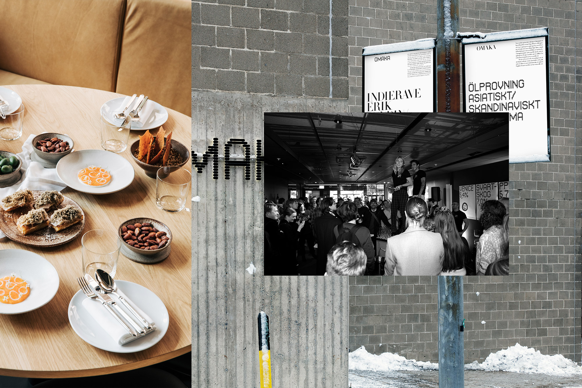
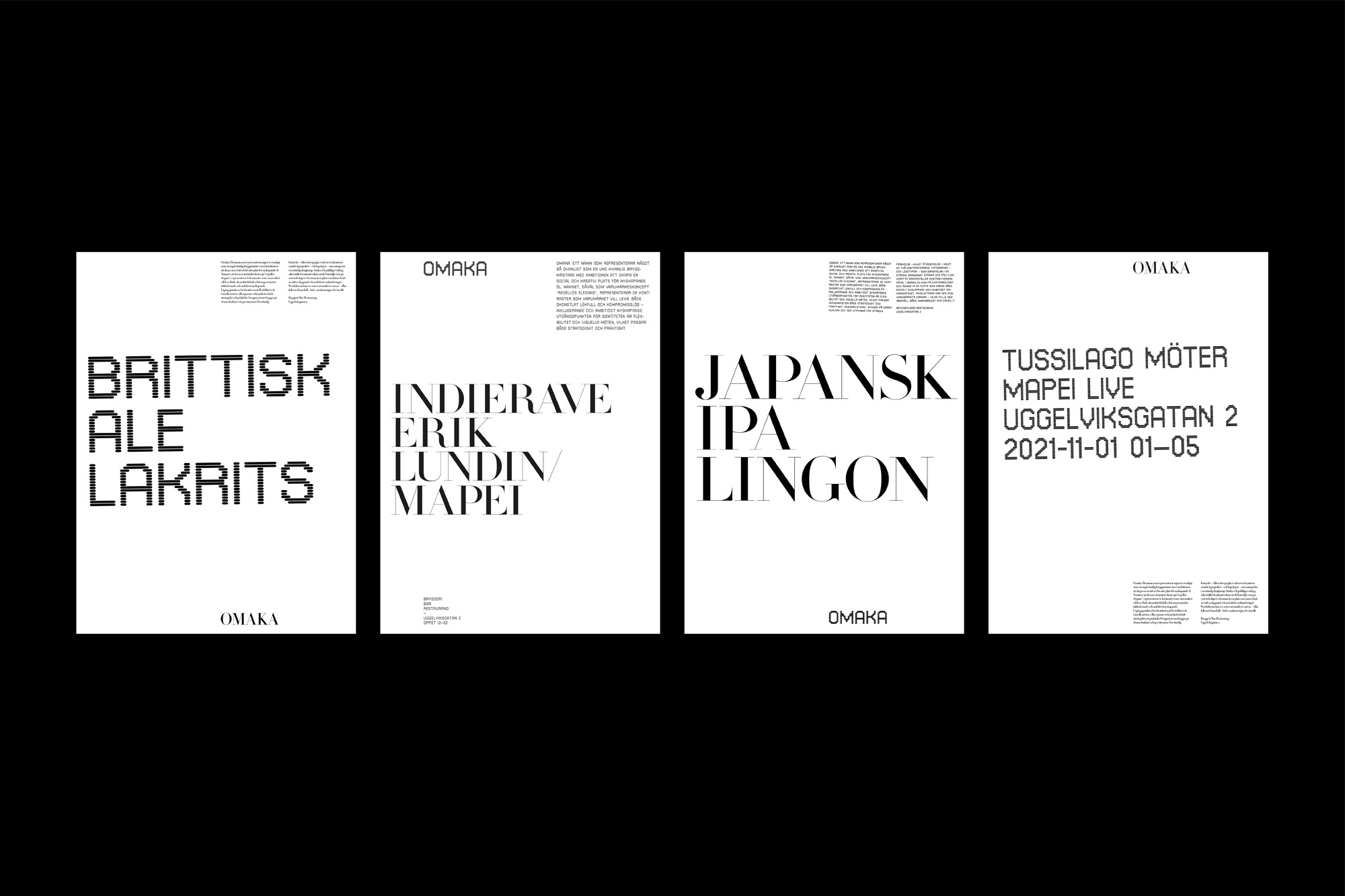
It is cleverly done and extends well to poster layouts where the Swiss restraint of a strong grid and the typographical contrast between large and small emphasizes the idea of imperfect symmetry, though the text variant of the digital typeface is more legible than Didot at smaller sizes. Neither is quite the workhorse font needed for body copy and a monospaced alternative in lowercase might give the scheme greater flexibility.
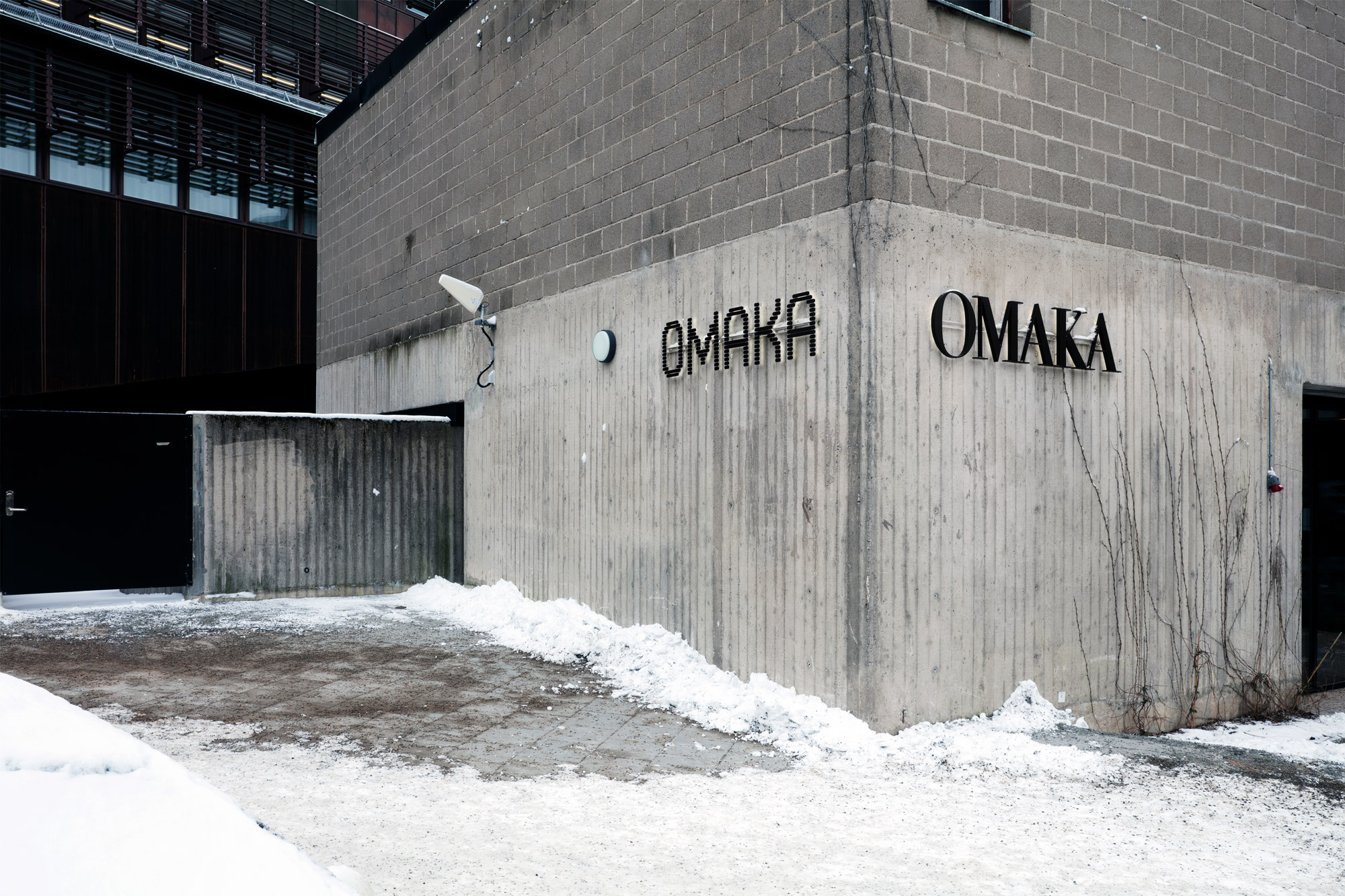
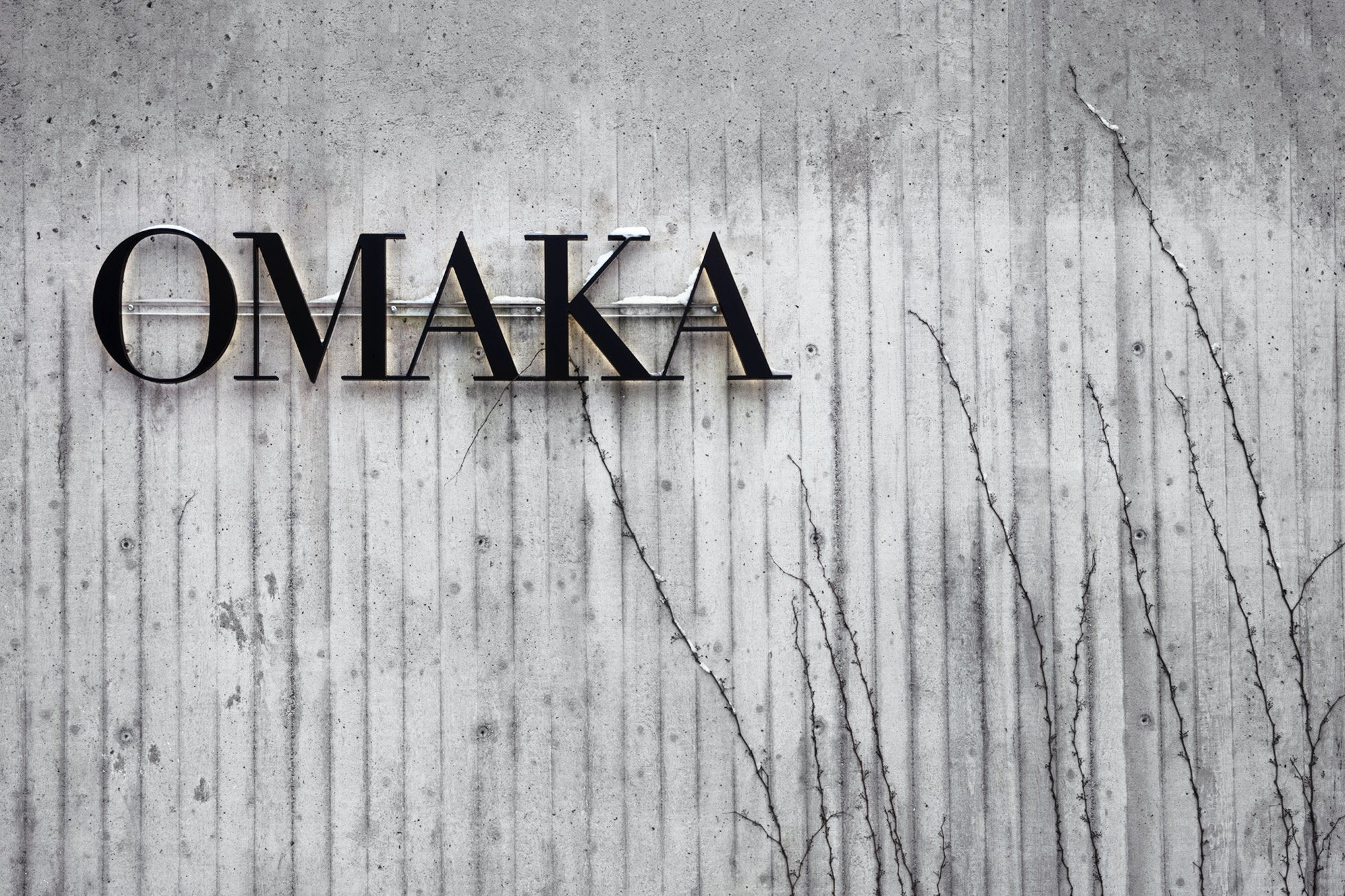
The signage is striking – set against a concrete wall, topped off with security cameras and snow, it’s a picture of Nordic noir – but the logo/s also suffer at smaller sizes: the thin strokes of the serif are lost while the horizontal slabs that form the partner wordmark bleed together.
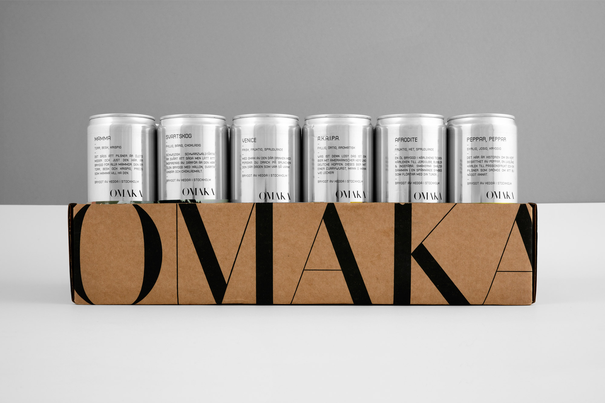
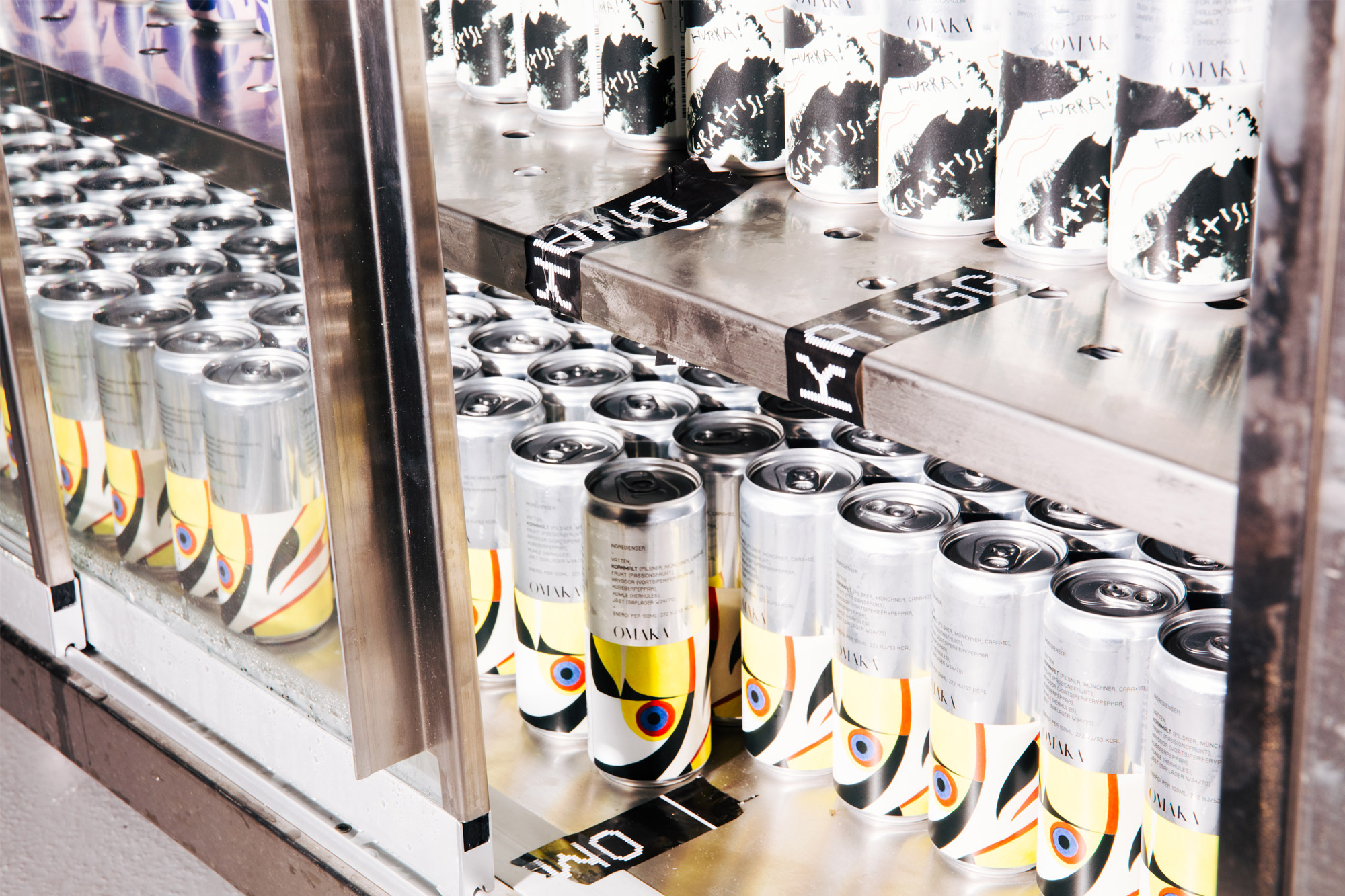
Nevertheless, Stockholm Design Lab’s packaging system is extremely successful. The collection of bottles and cans comprises a repeatable structure of two complementary halves. Here the central brand idea (‘omaka’) is fully developed, pairing graphic clarity with the changeable and unexpected to reflect Spendrup’s beers, Siberg’s experimental flavors, and the relationship between them.
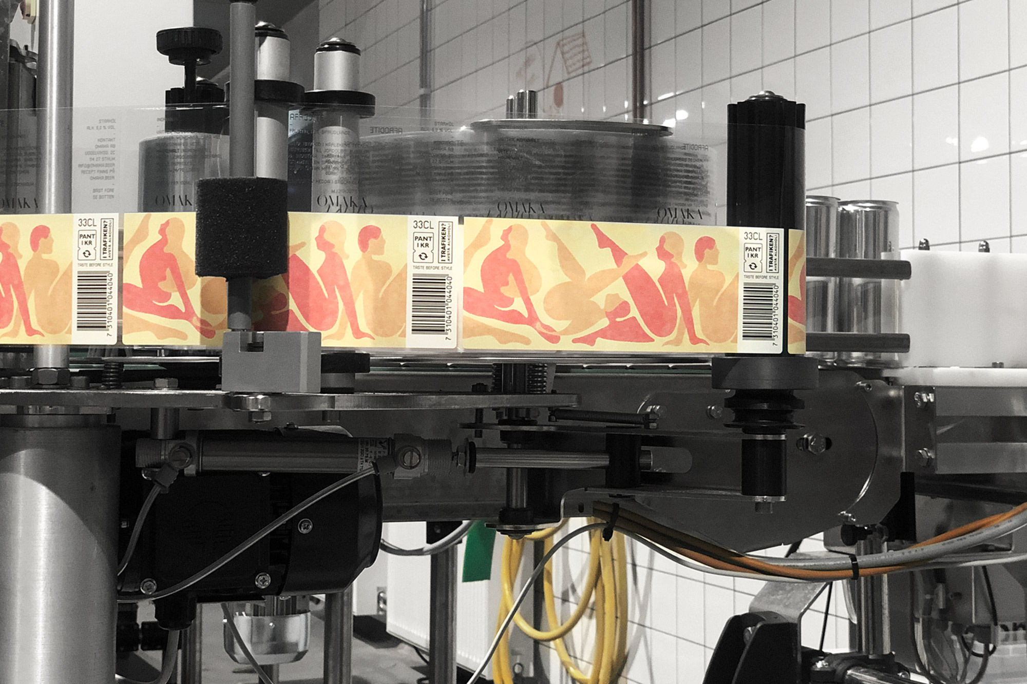
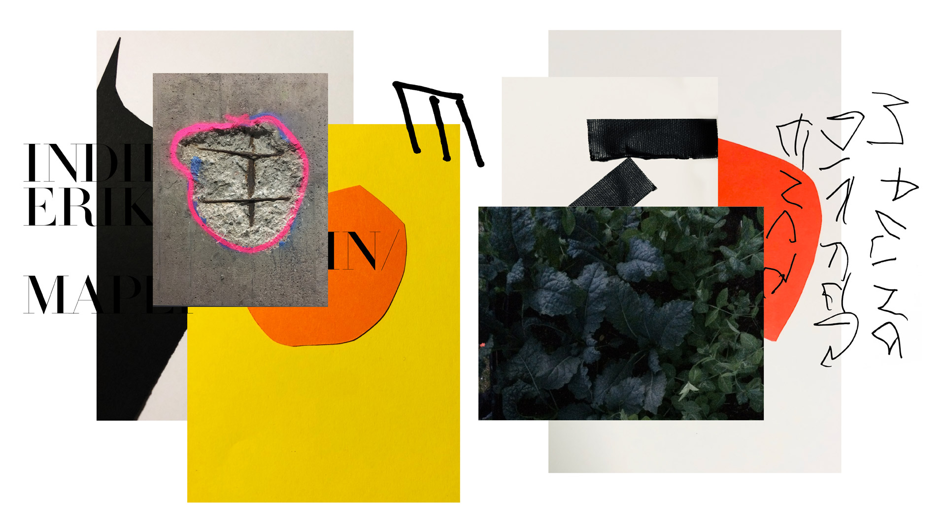
The bottom section is a canvas for an eclectic selection of collage, calligraphy, photography and painting – as well as graffiti and digital art – united by abstraction and a colorful palette. Bold artistic expression meets mass production with a utilitarian upper area where essential information is ordered in neat, practical lines of text. There’s a consistent typographic treatment, in harmonious imbalance with the freedom of the artwork below.
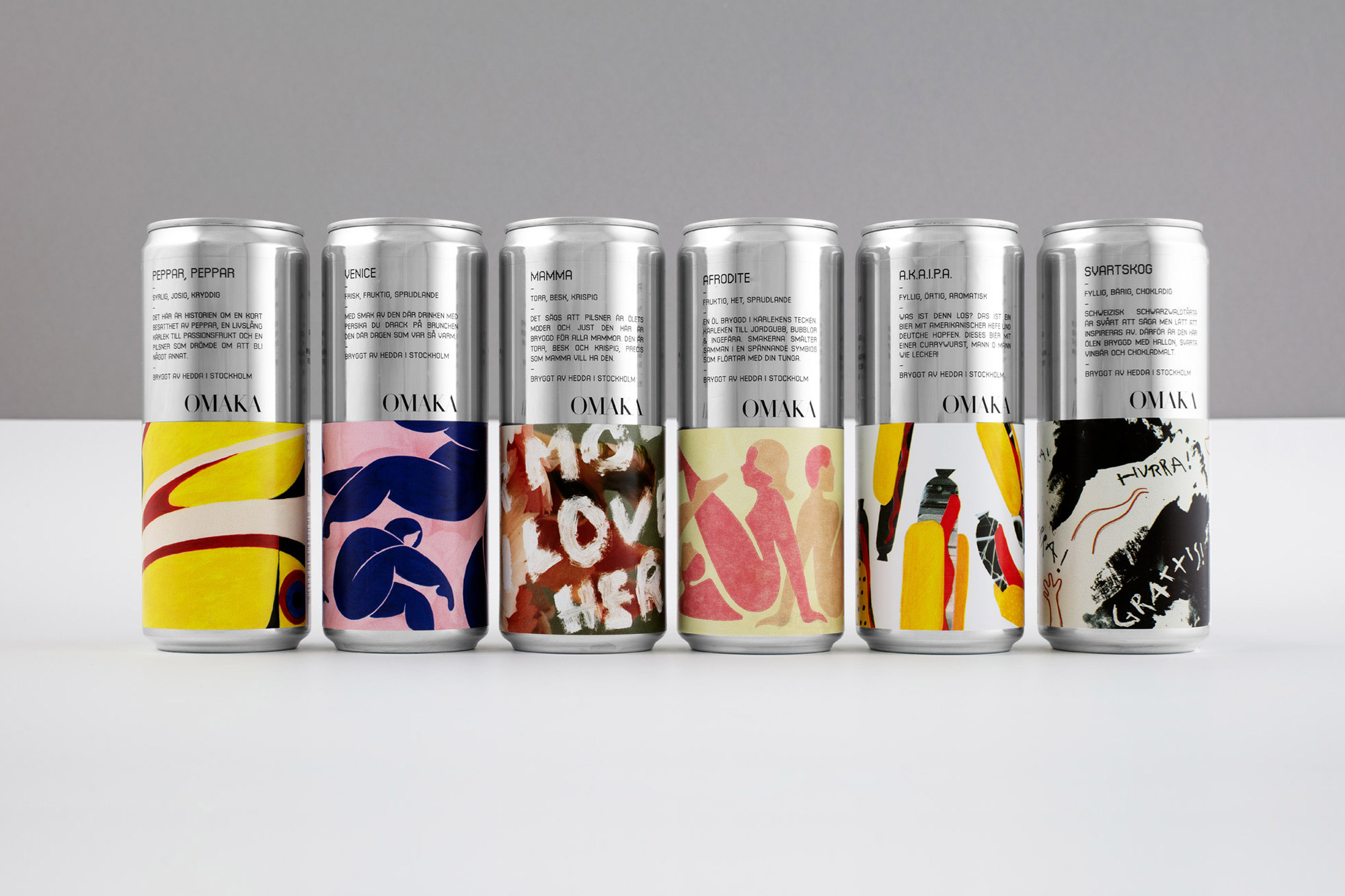
The individual impact of each of the beers (with names like ‘Mamma’, ‘Afrodite’ and ‘A1’) is secondary to the impression of the full range – and this perhaps applies to the identity as a whole. Each logo is understood by its context to the other; the two typefaces are most effective in combination; and materials such as Kraft and aluminum create a stronger impression when they are juxtaposed.
This is a beautiful piece of work, exploring the complexity of duality as a concept and discovering that more than one counterpart can nearly always apply. These pairings can complete one another, or compete – but they can also reveal new qualities, of both the sum and the parts. By prioritizing ‘taste before style’, Stockholm Design Lab reject a trend-led approach, but the project is both tasteful and stylish, as well as accomplished and smartly executed.
